Native advertising performs the best for both advertisers and publishers when the Native ad zones appear exactly like the content of a publisher site. Additionally Native can increase conversion rates for advertisers and improve user experience when they display a title and description text and the ad zone is highlighted that it contains ads. For advertisers this generates more qualified clicks and for publishers this increases the value of your Native ad zone leading to higher CPMs and bigger revenues.
AdNation’s Native ad zones are fully editable in your admin panel to ensure that the zones do look exactly like your editorial content. If you are not doing this you are losing out on significant revenue increases.
We carried out a publisher case study comparing Native ad zones that were not optimised to look like editorial content and the results after 10 days of implementing these changes on both the mobile and desktop version of the site.
We looked at: How the Native widget was optimised, CTR change before and after optimisation, CPM change before and after optimisation and Revenue increase before and after optimisation.
Publisher case study
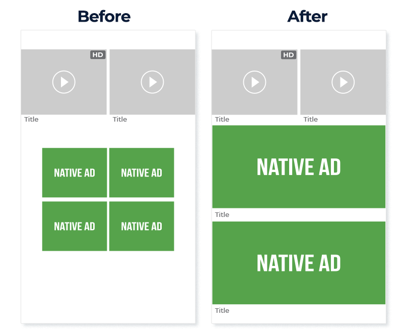
“On the mobile version of my site, originally I was using the 2×2 widget. The images were small and squashed close together. My account manager recommended that I try the 2×1 widget to see if that had a positive change on revenues and to also add in a title text the same font size and color of my site. I enlarged the Native images so that they filled the full screen of the mobile device to make the Native ad zones really stand out. This worked much better on mobile for user experience because the end user scrolls down through the content and the Native ad zones look like highlighted content when compared to the previous four small images I was using. This had a positive effect on both CTR and CPM. “

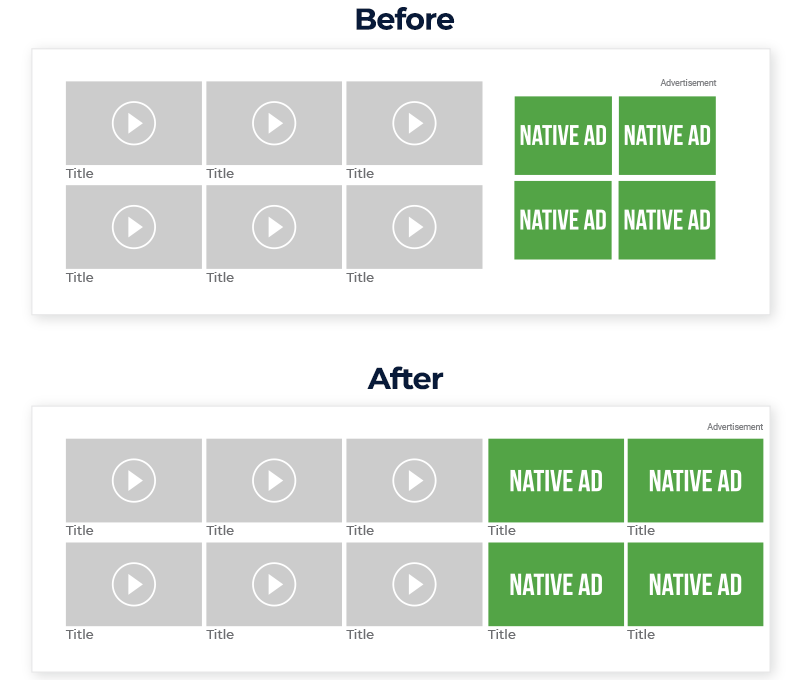
“On Desktop I was using a 2×2 widget. Because of user experience on desktop I always labeled the section as an ‘Advertisement’ and originally I didn’t include a title and the images were slightly smaller than the content thumbnails on the site. So I changed the thumbnails to the same size as my video thumbnails and added in a title in the same font and colour as the rest of my site. This saw a smaller increase compared to the mobile version, but was still very positive.”

“Here is an overview of how I saw improvements after 10 days of implementing the way I showed my Native ads on mobile and desktop.”

Read our full tutorial for setting up Native Ad Zones to see how you can customize your Native ad zones to boost eCPMs and revenues!
